Opinions on my van?

Talk Electrician Forum

Help Support Talk Electrician Forum:

This site may earn a commission from merchant affiliate links, including eBay, Amazon, and others.

sellers

Well-known member
Joined
Feb 2, 2009
Messages
2,583
Reaction score
-2
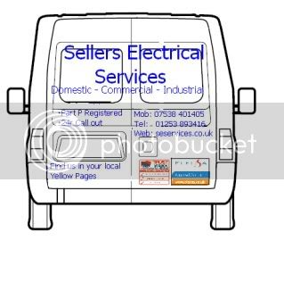
been having a play on paint for some ideas for signwriting my van, this is what I've come up with to give to the signwriting dude.

Gonna get him to play around making different shades of blue so its not as block.

What do you think of the general layout and content?

thanks
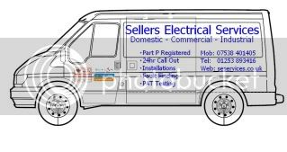
Transitside.jpg


Transitrear.jpg


I hate the term 'part p registered' as it is somewhat made up I think. Other than that it does the job. I'd get a logo going on somewhere.

 
im not keen on the term either lurch, but its what i get asked from the public, 'are you part p registered'

 
im not keen on the term either lurch, but its what i get asked from the public, 'are you part p registered'
Yeah, I was just looking for alternatives, can;t make anything that makes sense. I know what you mean though, JP has heard of part p, therefore you need to mention compliance with part p in some snappy manner. I don't think it would make much difference on the van though if it wasn't there. I'd just have company name, logo, web and phone and maybe a tag line on mine. It's not a mobile billboard, KISS.

 
Its looking good , Sellers , but for my own taste I think there is too much on there, its a bit like mobile billboard. I appreciate that you are trying get an advertising message across and you've covered all the bases there except your shoe size. Its all a bit too busy.

I'd omit the Part P bit, only people within the trade know what it means ,unfortunately.

Also omit fault finding and pat testing, just need to state that you are an electrical contractor , those items are part of it.

Move the word " Installations" to after Domestic- Commercial etc.

I also feel that one phone No. does the job , more is confusing.

ELECSA logo, yes , show that you are a member of a trade body.

Can't read the other logo , again may be OTT.

The back of the van looks too much to me , I look for , Name of company- what do you do- Phone no. After reading all that they would have forgotten your name !!

Please feel free to totally ignore my opinions, the Missus does it all the time. :coat

Deke

 
I have to agree with Deke, it looks messy with far more information than you actually need.

Name, website, phone are the main three. You will only get phone calls from standing traffic, static ie outside a job, whereas if you had a website most people find it easier to remember you.Most important, and what gets people looking in the first place is a logo.

The Elesca should stay, and get a sticker from the yellow pages, its free and no need to signwrite.

Tell everyone what you do elsewhere and not on your van, it should be simple to the point and rememberable.

 
What sort of van have you got? (big one or little one?)

It is quite busy. I would leave both phone numbers on.

Maybe drop PAT testing, installations and fault finding? It's a bit implicit.

A logo would be good!

I know what you mean though, JP has heard of part p, therefore you need to mention compliance with part p in some snappy manner.
JP?

 
Joe public.

It does look crowded, I'm going to get them to make the name and dom, com and ind, fit the pannels at the top. Then make the rest of the writting smaller and underneath the window pannels. And like you've said drop some of them. Keeping the 2 logos on the doors. Same with the back.

 
Maybe a cartoon of a person's body in suspenders stuck on the drivers door driving would look good!!

Would certainly get peoples attention.

Regards all , Mike

 
Top